Innovative UI Needs a Secret Ingredient: Familiarity
New and more creative user interface designs seems to be coming thick and fast in recent years. But the cleverest designs need to be anchored in familiar concepts to be intuitive.
Over the last decade (yep, the iPhone is 10 years old next year), we've been inundated with new categories of computing devices: smartphones, tablets, smart watches and a whole host of concepts, some successful, some not. These new devices have all come with a host of new kinds of interfaces, from multitouch to the Digital Crown. It's the latter that caused me some confusion over the past few days.
I've recently been using a set of bluetooth headphones that lack their own volume control, so rather than take my phone from my pocket, I tried to change the volume on my Apple Watch through the Now Playing interface:

Seeing the volume icon at the bottom of the screen, my first instinct was to touch this circular "button", which opened up a volume control with plus/minus buttons and an indicator:
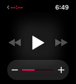
This didn't seem like the most ideal way of controlling volume, as it required no less than four (and sometimes five) interactions to adjust the volume. A great departure from having a volume control right on my headphone cord.
However, the second or third time I went through this process, my hand brushed the Digital Crown and I discovered that it was linked directly to the volume "ring" in the Now Playing interface, which lit up in a friendly green when being changed with the Crown.
This effectively cut the number of touches or button presses in half, and rotating the Crown was a much better experience for finding the ideal volume than repeatedly tapping a plus or minus button. However, since I'd never seen this kind of control before, I had no way of knowing that this was an option.
The first graphical interfaces were ingenious in that they anchored themselves to concepts that office workers would already be familiar with: desktops, folders and trash cans. So once a user was familiar with the idea of using a mouse, the rest would follow fairly quickly.
There is certainly room for new ideas an innovation in user interfaces, but these ideas must have a familiar concept that will help guide a new user along.
This also underscores the need to have your UI designs tested by potential users as early and often as possible. As developers we know our software so well that we don't need to learn how to use it, and cannot possibly determine on our own how easy, or difficult it is to learn to use our apps.